
CCIV has been on an absolute tear higher. The stock has run from 20 to 70 over a month. Why? Did they have good earnings? Analyst upgrade? Nope– they might bring Lucid Motors onto the market. (Might.) CCIV is a SPAC– Special Purpose Acquisition Company. I won’t go into details on how these work, yet […]
Main Content

Time to Call a Top in Solar
There has been a fundamental shift in the solar industry. Panels are cheap enough to where they can be financed, and the cost savings from power can take care of the monthly payments. And that narrative is probably right in the long term, and it’s a good thing. Now that we’ve got that out of […]
Winning In Both Directions
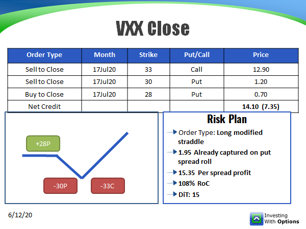
This has been a wild market, and you can make money on both the long and the short side. I’d like to share with you two trades we put on at IncomeLab. The first is a bet on long volatility using the VXX, and the second was a breakout bet in NET. These setups were […]

Big Water, Small Hose
The Russell 2000 index is over 20% above its 50 day moving average. I checked the past 20 years, and this hasn’t happened. The selloff in March was extraordinary, but the v-rally we’ve seen has mirrored just how wild the market has become. We can chalk it up to lots of fundamental reasons… the better-than-expected […]